
Mark Furland | Tony Lawrence | Rich Rarey
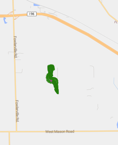
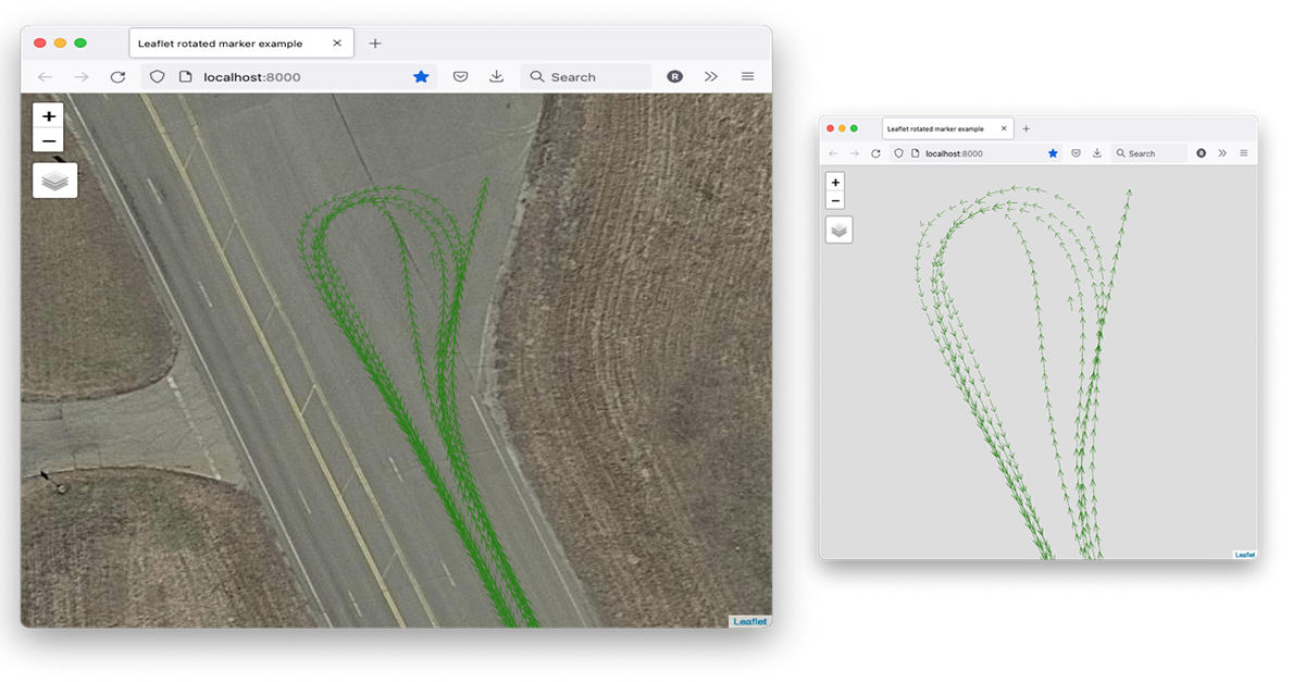
Figure 1. The blob of green is an early attempt at visualization.
During field testing in Tome’s Bicycle-to-Vehicle (B2V) safety project, we often generate megabytes of real-time data from bicycles, scooters, pedestrians, and vehicles moving around the test track, charting their GPS position, speed, heading, four axes of acceleration, and other related data.
Ten times a second, each bike, scooter, etc. gathers its current location data, encodes it as a SAE J2735 standard Personal Safety Message (PSM) and transmits the message using Bluetooth technology to a nearby receiver, which dutifully logs every incoming message.
Our casual attempts to visualize the location of the moving vehicle on the track, superimposed on an Internet map, was disappointing. As you can see in Figure 1, the early attempt to build our own tool created a green monster that was the sum-total of every path the vehicle made, and from this distance perspective, it’s a mess!
For the July 2021 Tome Lab Day, three of us decided to work together to clean up this mess and redesign our tool so that it
- Will not require any online resources to display. Outcome: Success
- Lets the user choose the layer background. Outcome: Success
- Lets the user choose which vehicle to display. Outcome: Success
- Takes no longer than one Lab Day to implement. Well, it’s kinda functional now
We built a Docker container that contains two parts: a Vector Tile Container, and a Visualizer that hosts a website running on the same machine.
Vector Tile Container
Designed for another project, it’s a self-contained, internet-free vector tile provider. You provide an mbtiles file, and it serves a mapbox gl js style that will use tiles on whatever host it’s on.
Visualizer
This part takes the comma-delimited CSV of the decoded Personal Safety Messages, and tries to visualize it.
Currently all it shows is location and heading, with a popup for more information.
It will try to show all devices as different colors.
Figure 2 is a close up of the same location data, more attractively presented, with arrows showing heading.
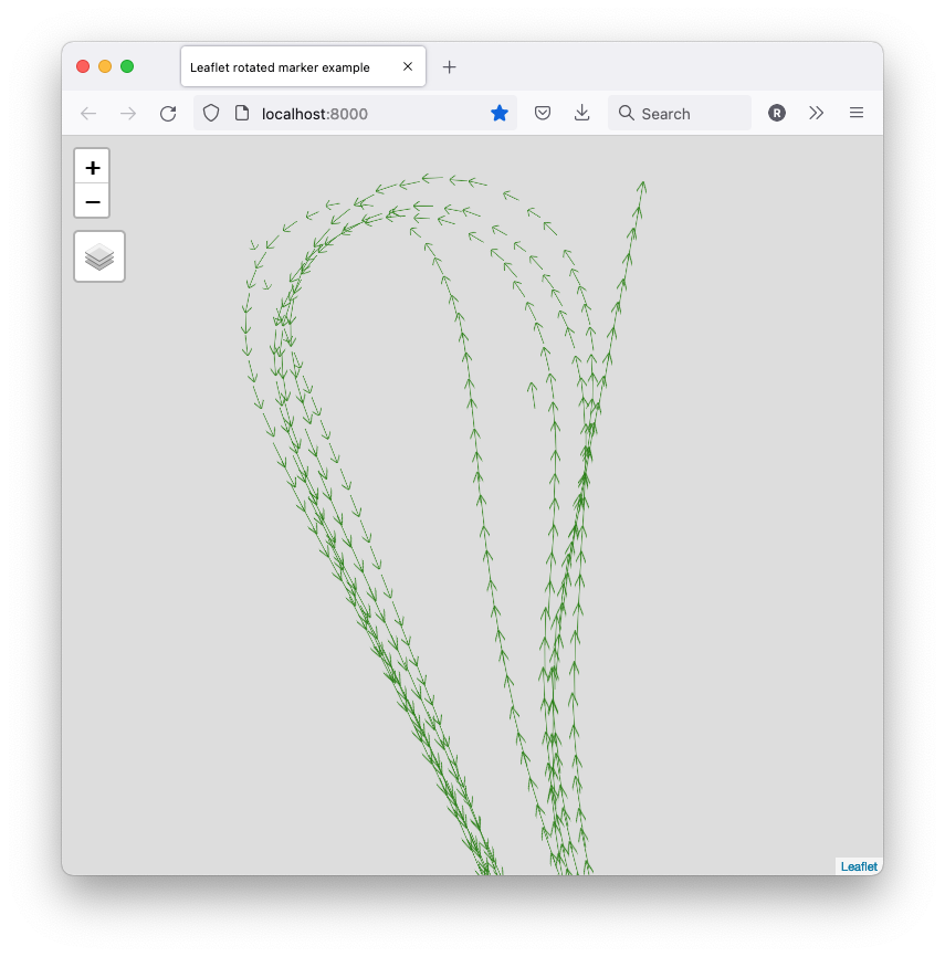
Figure 2. Visualized location data, arrows indicate heading.
A layer selector was added that lets the user choose the vehicle (all vehicles, and no vehicles, too), and set the background layer.
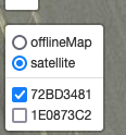
Figure 3. Select the view that’s right for you
Now, we can view same data, shown in Figure 4. with a the satellite view layer (that does require internet):
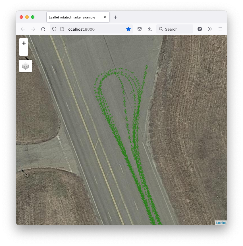
Figure 4. Using a satellite view layer of the same data.
The Figure 5. shows multiple vehicles:
A stationary vehicle (purple) moving very little, while another vehicle (green) tracks around it.
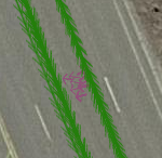
Figure 5. Showing multiple vehicles.
Finally, clicking on any of the “arrows” for either vehicle will pop up some essential details:
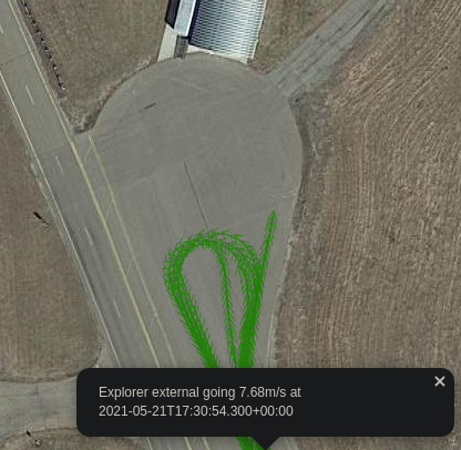
Figure 6. The essential details of the PSM data, popped up on demand.
This Lab Day project was a quick, pleasant exercise that returned useful benefits for the B2V project, while giving our Lab Day team a chance to play with and display gathered data.